I design productsthat people actually want to use.
Over the past decade, I've designed experiences across healthcare, telecom, fintech, and automotive, turning complex systems into products that feel simple, intentional, and worth believing in.
Selected Works
Bank of America
Senior Experience Designer · Publicis Sapient
Healthcare · Enterprise · B2C
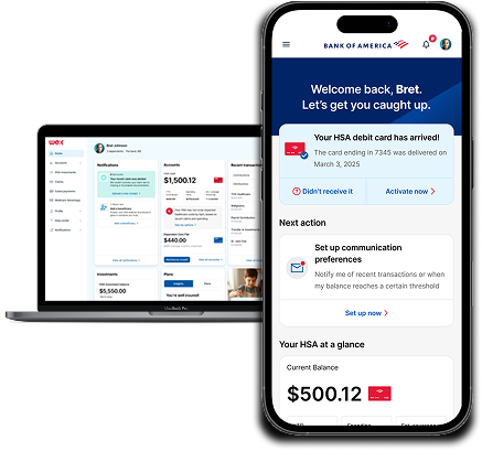
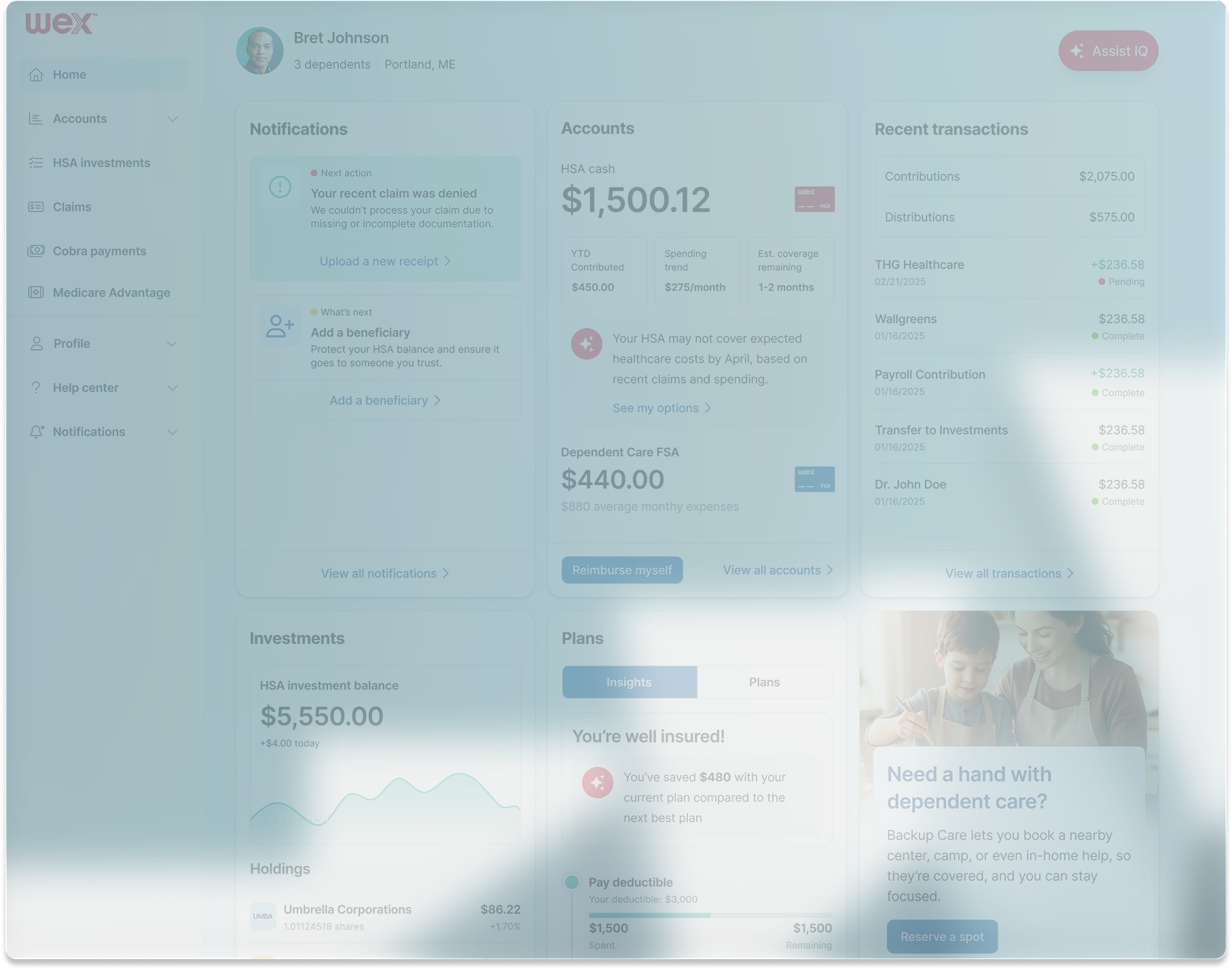
Designed high-fidelity experience moments for WEX's Consumer Driven Healthcare platform, addressing Bank of America's key pain points to support a critical client retention presentation and lay the groundwork for a unified benefits engagement hub.
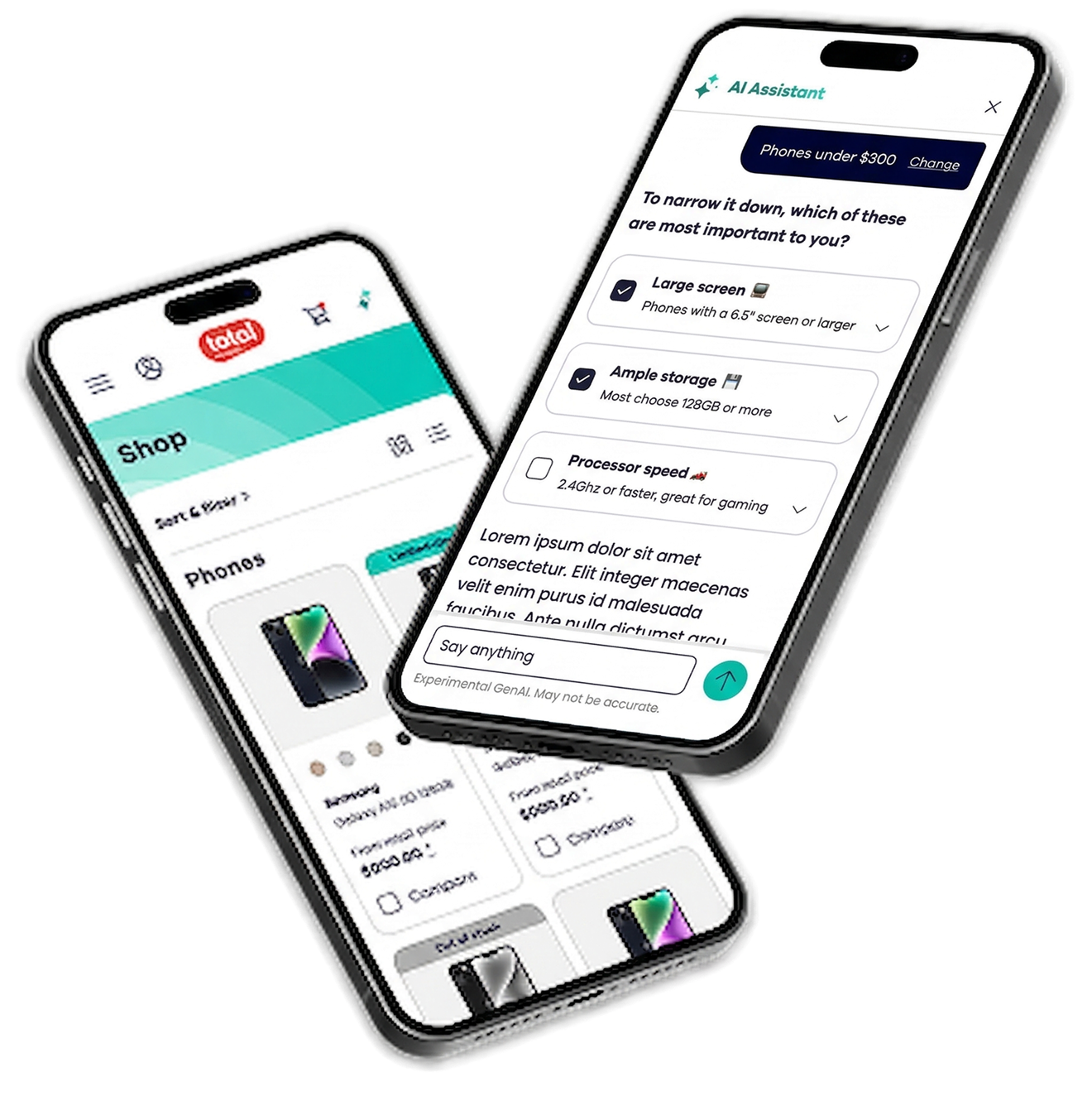
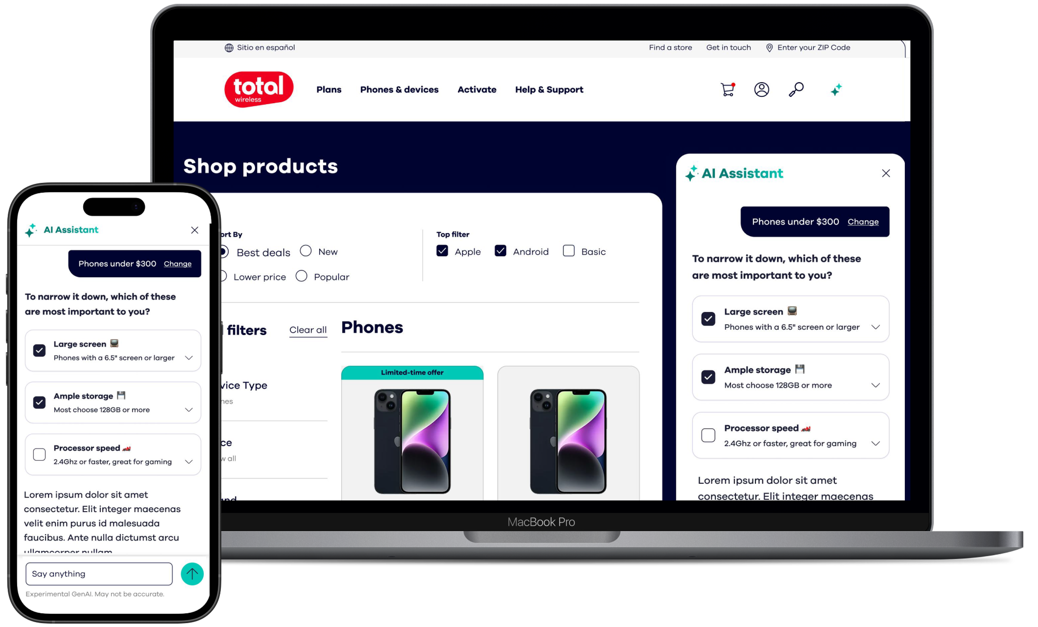
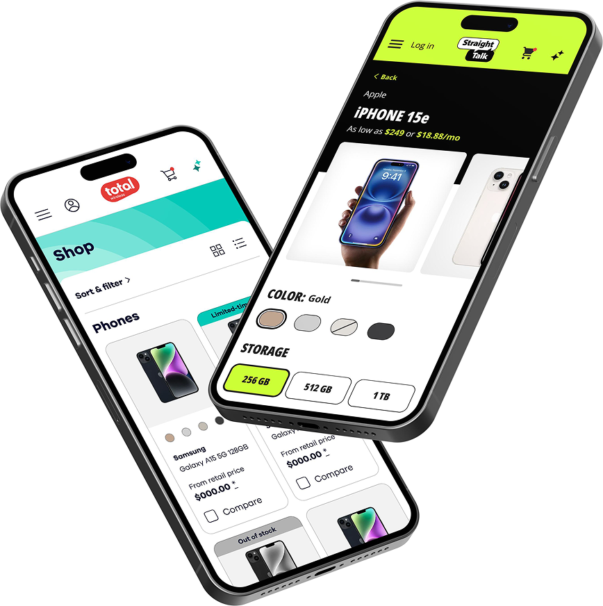
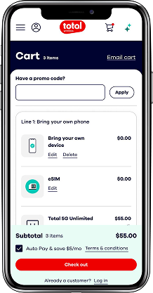
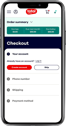
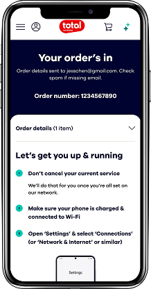
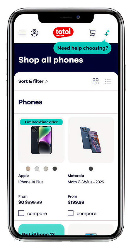
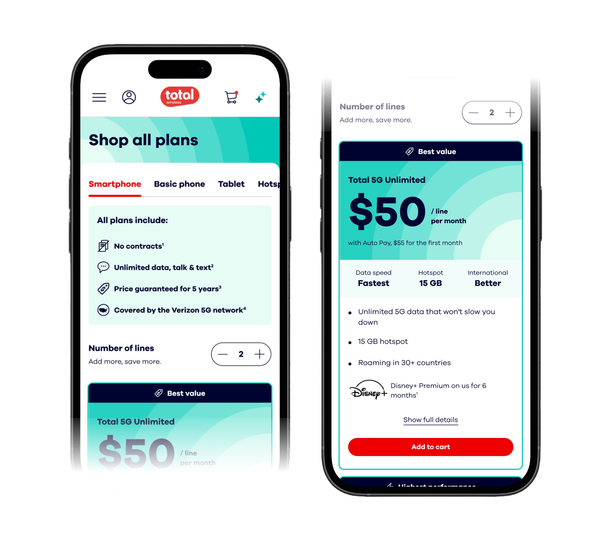
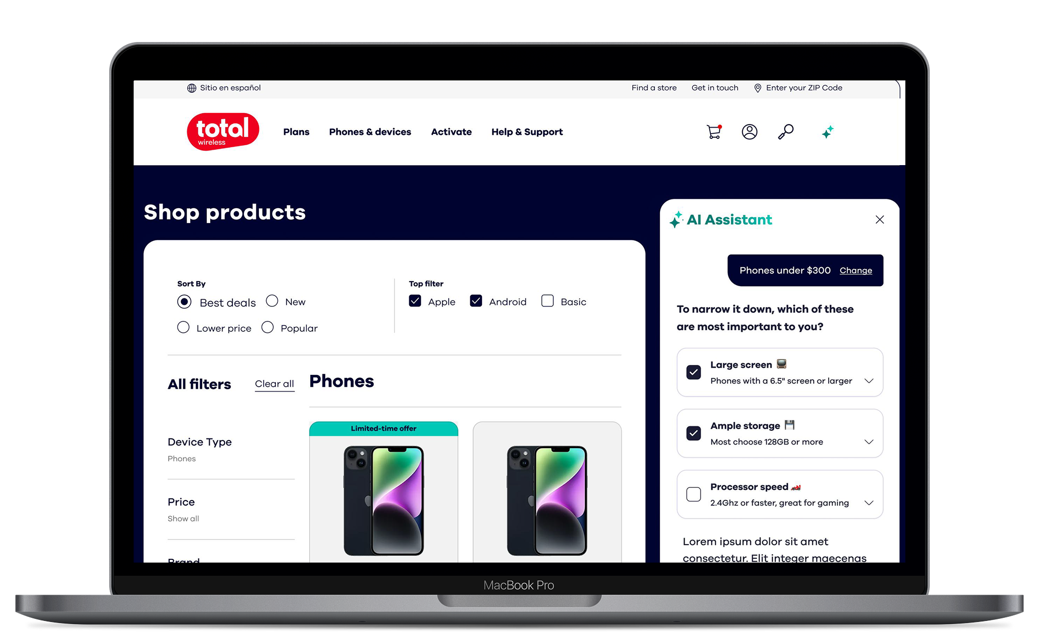
Led the redesign of Total Wireless's web experience and introduced an industry-first AI shopping assistant for the prepaid space, closing the gap between competitive pricing and a premium experience through a scalable white-label design system.
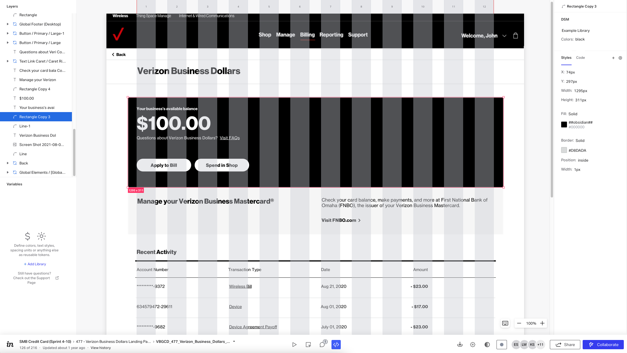
Designed the credit card redemption experience for the Verizon Business Mastercard, integrating loyalty and e-commerce flows across the MyBusiness portal and native iOS app for small business customers.
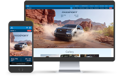
Led UX design for Honda's flagship automobiles website, improving vehicle page performance, redesigning the Build & Price module, and transforming a paid media microsite into a full-featured platform experience serving millions of users.
Design isn't about making things look good. It's about making things work better for people. I approach every problem with systems thinking, connecting user needs to business outcomes, craft to clarity, and complexity to simplicity. Every decision is intentional. Every detail earns its place.
Experience
Publicis SapientOct 2023 – PresentSenior Experience Designer
Led end-to-end design initiatives, facilitated workshops and developed detailed designs for several multi-touchpoint enterprise projects across the Verizon account.
Boston ScientificMay 2023 – Oct 2023Senior Experience Designer (Contract)
Led design research for primary components in the Boston Scientific Design System and developed detailed designs for several business units including BostonScientific.com, Preventice, Watchman.com, and corporate responsibility.
Publicis SapientJul 2021 – Apr 2023Senior Experience Designer (Contract)
Led end-to-end design initiatives, facilitated workshops and developed detailed designs for several multi-touchpoint enterprise projects across the Verizon account.
Kanna StudiosMay 2020 – PresentFounder
Led a content marketing agency helping purpose-driven brands improve their brand awareness and increase profitability through video and photo content across social platforms.
RPAMar 2017 – Mar 2019User Experience Designer
Worked closely with the UX design team on projects for Honda, Arco, Farmers Insurance, and Halo. Responsible for user flows, wireframes, and leading design reviews with internal and external stakeholders.
Inhance DigitalDec 2014 – Jun 2016UX Designer (Contract)
Led UX design for interactive mural displays and Mixed Reality experiences for trade show booths. Collaborated with Creative Directors, UI Designers, Developers and Producers for clients including Schlumberger, Honeywell, Audi, Boeing, and GE.
About
I'm Ahlyzik, a multidisciplinary designer based in Los Angeles with over a decade of experience turning complex problems into clear, purposeful products, connecting design decisions directly to business goals.
With over twelve years of experience, I've designed across enterprise platforms, fintech, medtech, trade show activations, mixed reality, and complex multi-touchpoint experiences spanning multiple devices. That range taught me how design decisions connect directly to business goals, and how to solve for real user needs across any screen or context.
Today, I bring that foundation to senior roles at agencies and product companies, where I treat design not just as visuals but as a practical tool for clear decisions and long-term outcomes. Nothing excites me more than making someone's life in this digital world a little easier.
I'm also deeply interested in AI, not as a trend, but as a tool to simplify workflows, improve decision-making, and explore new creative possibilities.
When I'm not busy Designing™, you might find me riding my motorcycle through the canyons, exploring a new city, diving into different cultures and cuisines, or chasing that perfect photograph somewhere I've never been before.
Bank of America, one of the company's most visible enterprise accounts, had four documented experience gaps that were actively degrading trust:
no self-serve card activation
no digital claims submission
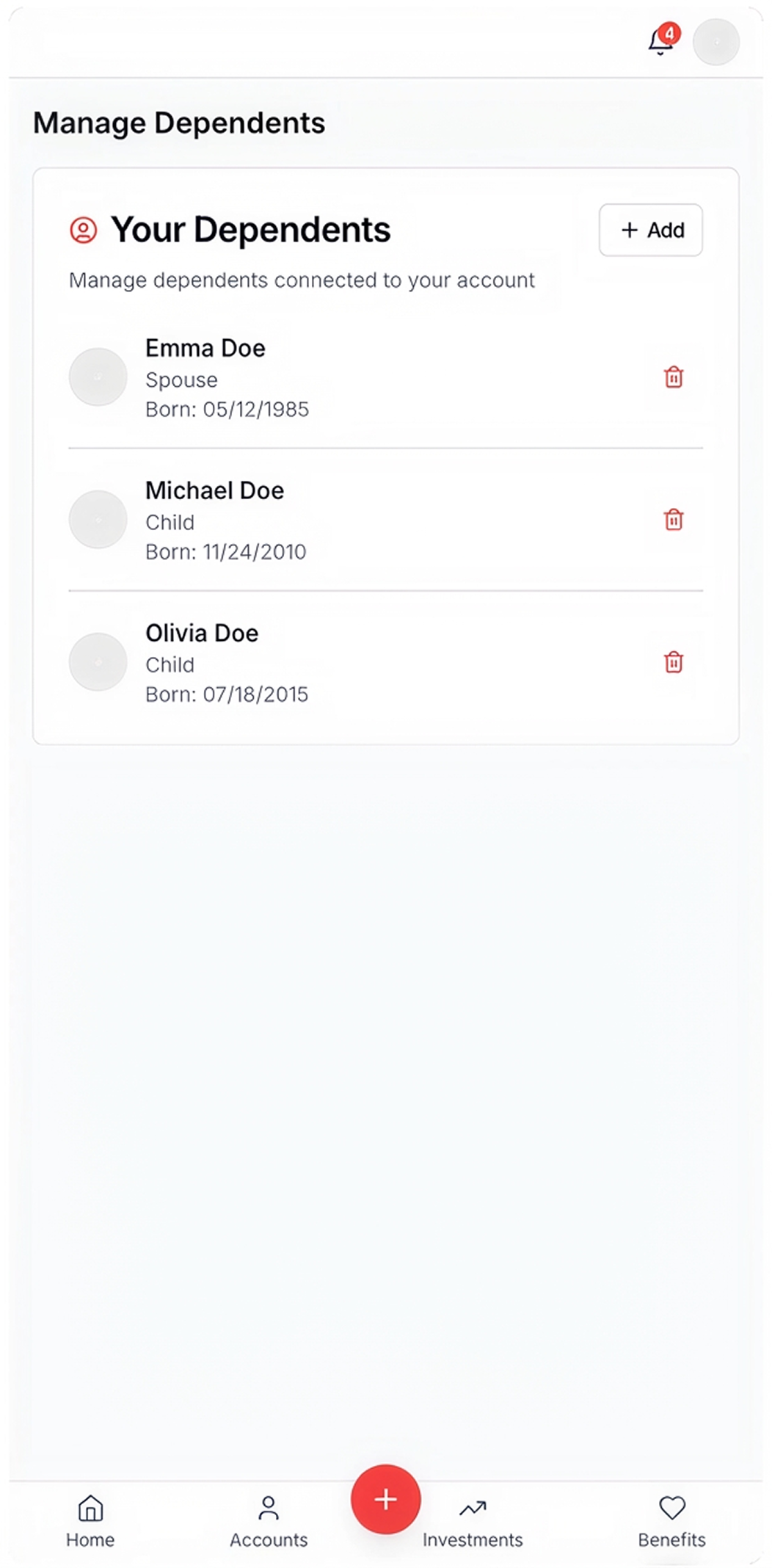
no participant-initiated dependent removal
a rigid framework that couldn't flex to employer brand standards.
The approach
Three sprints. Three deliberate bets.
Rather than trying to solve the entire platform in one pass, each sprint targeted a single, high-impact surface, building confidence and momentum across the engagement.
Sprint 0 Mar 17–28
Explore & Define
Identify user flows and brand guidelines
Prioritization of key moments
Light audit of proposed user flows
Sprint 1 Mar 31–Apr 11
Claims Flow
Digital submission of form-required, client-initiated requests
Iterate and refine visual assets with BoA branding
Collate concepts into a presentation conveying product value
Asset handoff, May 1
Research at speed. Grounded in precedent.
Used Claude for rapid competitive analysis and v0 for early UI exploration, mapping how CDH is structured across the market and benchmarking best-in-class flows to compress discovery into actionable design direction.
The work
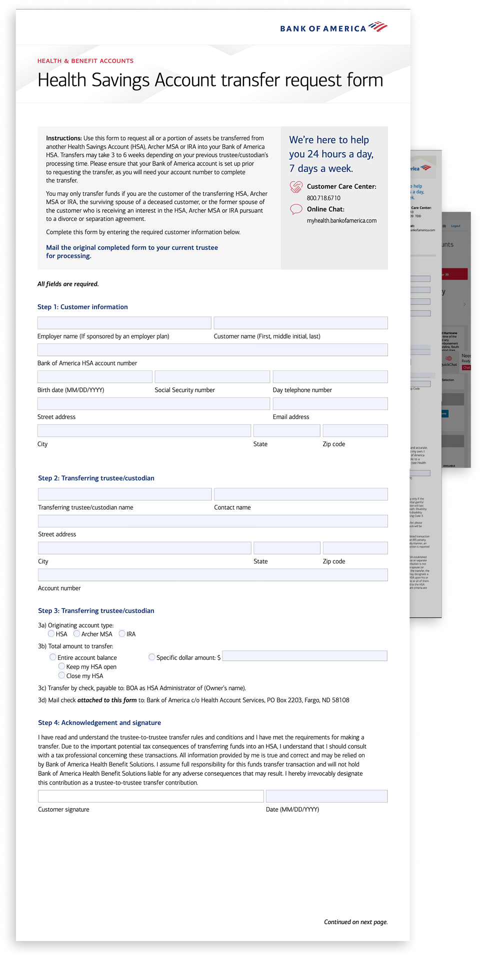
Digital Documentation. Done right.
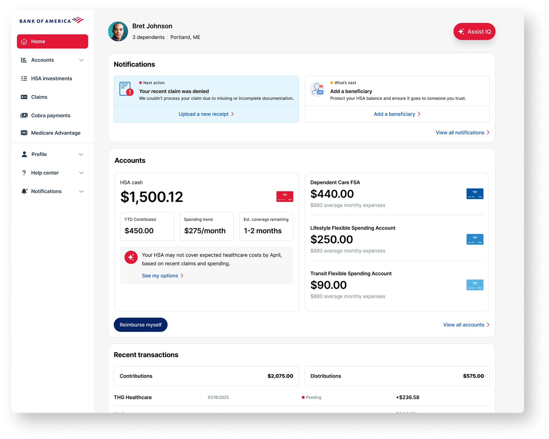
We digitized form-required requests to give clients a level of transaction control they never had before. By simplifying the UI, we transformed complex financial submissions into an intuitive and personalized self-service experience that allows for real-time corrections.
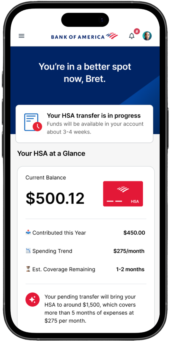
Giving users the real-time control they need to easily manage and strengthen their HSA.
Real-time status updates provide complete transparency from the moment an HSA transfer is initiated.
The outcome
All self-service. No friction.
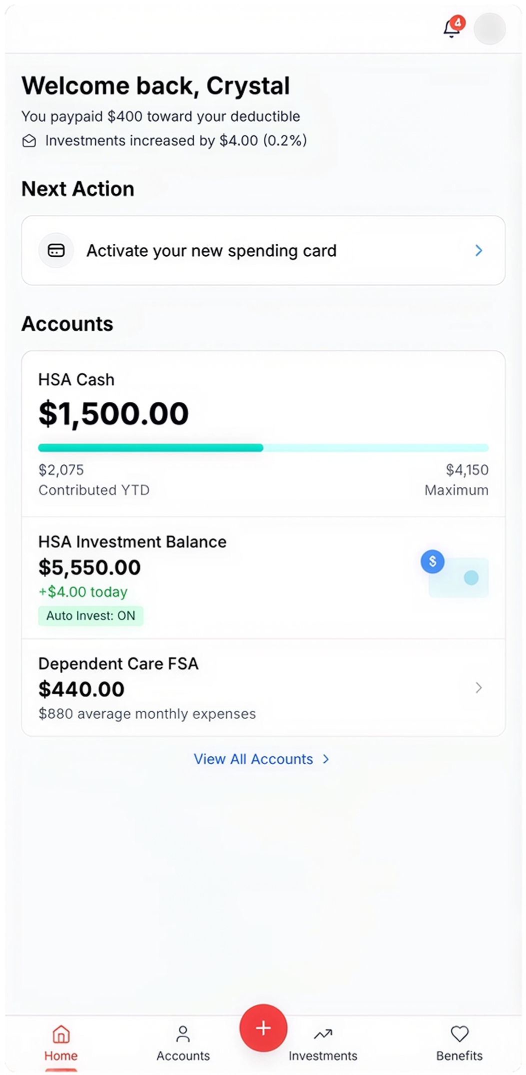
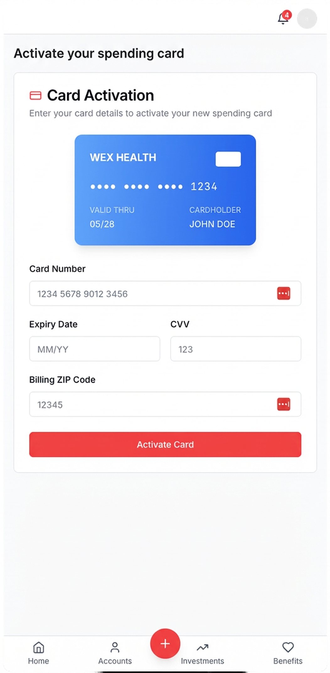
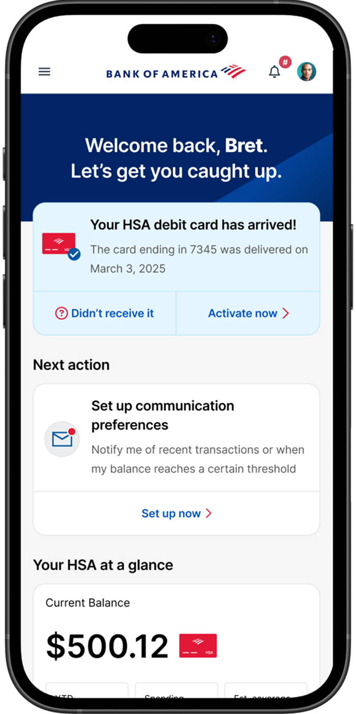
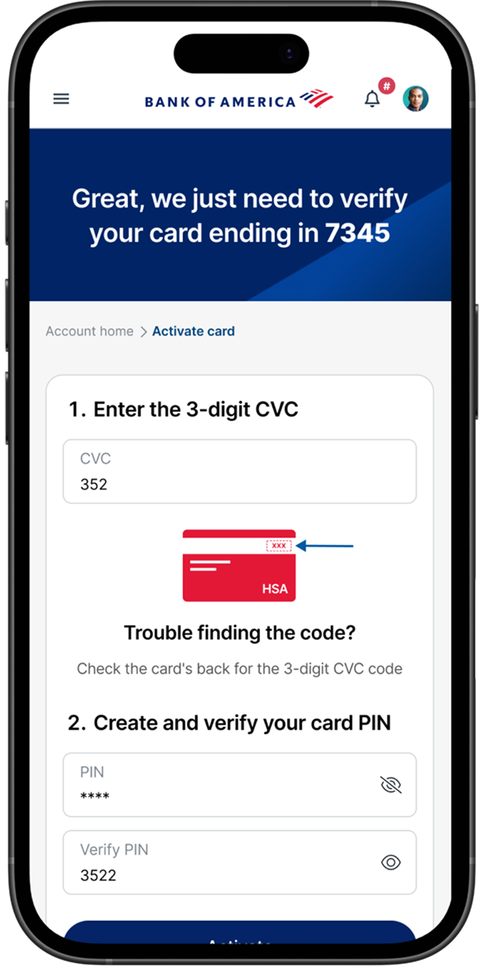
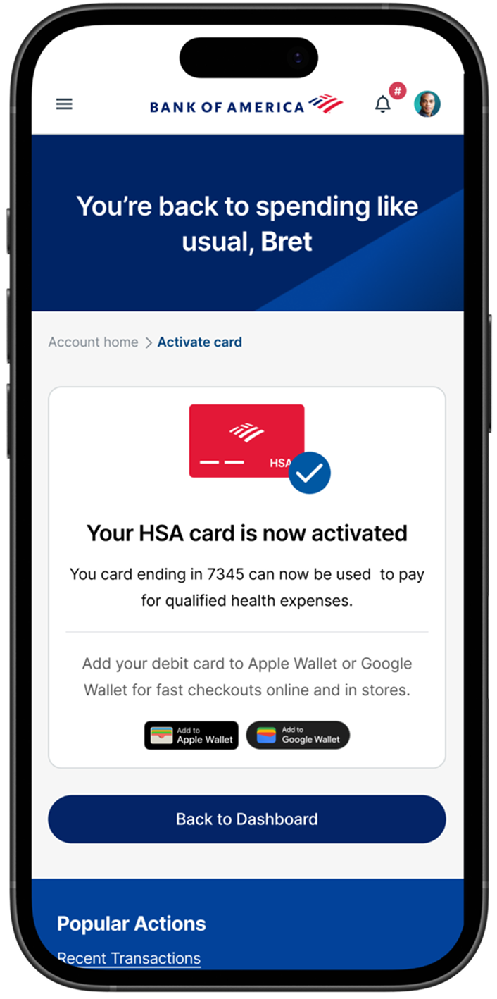
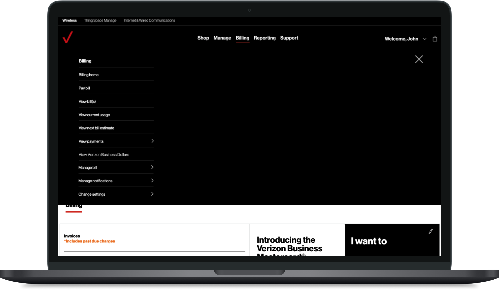
Two workflows that previously required a phone call, card activation and dependent removal, now live inside the portal. The account homepage was redesigned as the foundation for everything else.
Card activation directly through the portal
Helpful illustrations to guide users.
Clear communication on when their activation is complete.
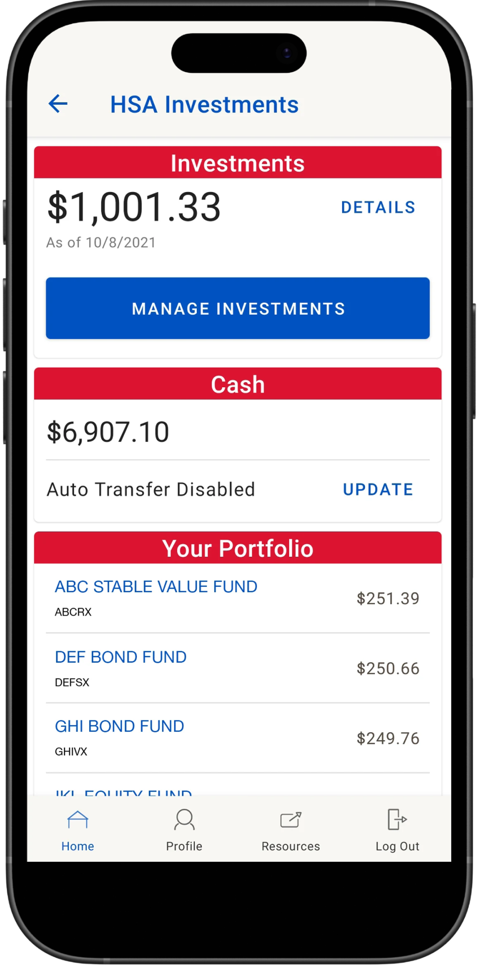
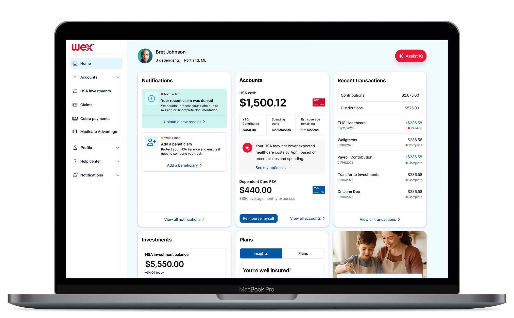
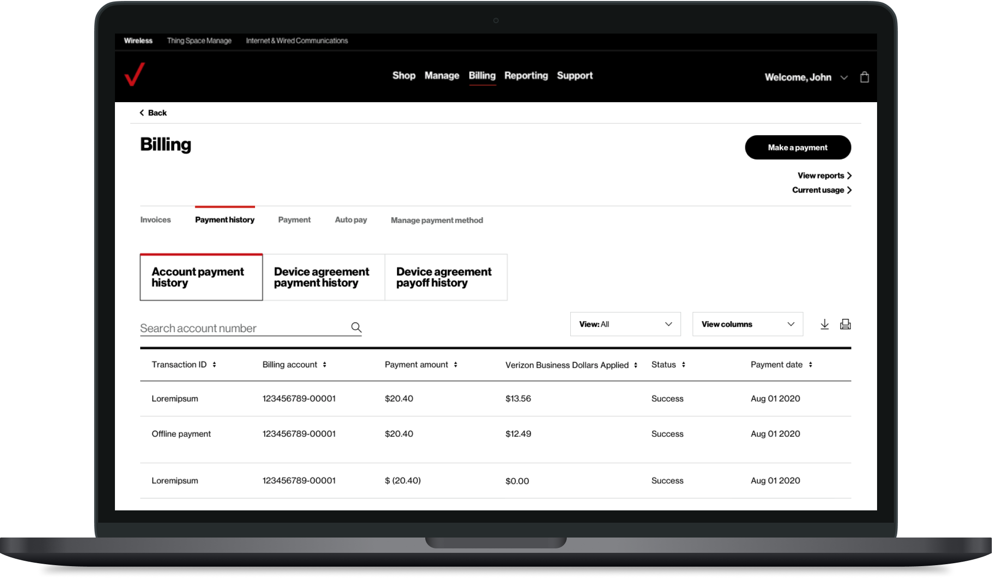
Same experience. Every screen.
The desktop portal mirrors the same self-service workflows, giving participants full access to card activation, dependent management, and claims tracking from any screen size.
By using Bank of America's Approval Tracker, participants see a clear timeline toward claim resolution, reducing anxiety, call volume, and the need for manual follow-up.
Optionality. No matter the platform.
I built a modular design system that gives employers full control over color, typography, and layout without breaking the platform's core integrity.
By using Bank of America's rigorous brand standards as a stress test, I ensured every custom configuration remains functional and visually polished across any environment.
Verizon's prepaid portfolio spanned several brands, each with its own fragmented digital experience. Low trust and quality perception was synonymous with prepaid. Churn was rising, and every new brand launch required rebuilding from scratch.
Each brand had its own codebase, design patterns, and user experience with no shared foundation
App Store ratings and NPS reflected a trust deficit that extended from the experience to the brand itself
The challenge wasn't just visual, it was systemic
15
NPS Score
Legacy app experience eroded brand trust and drove poor reviews
The approach
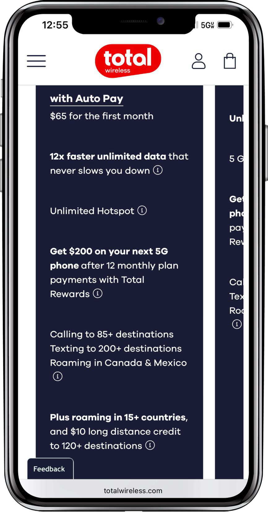
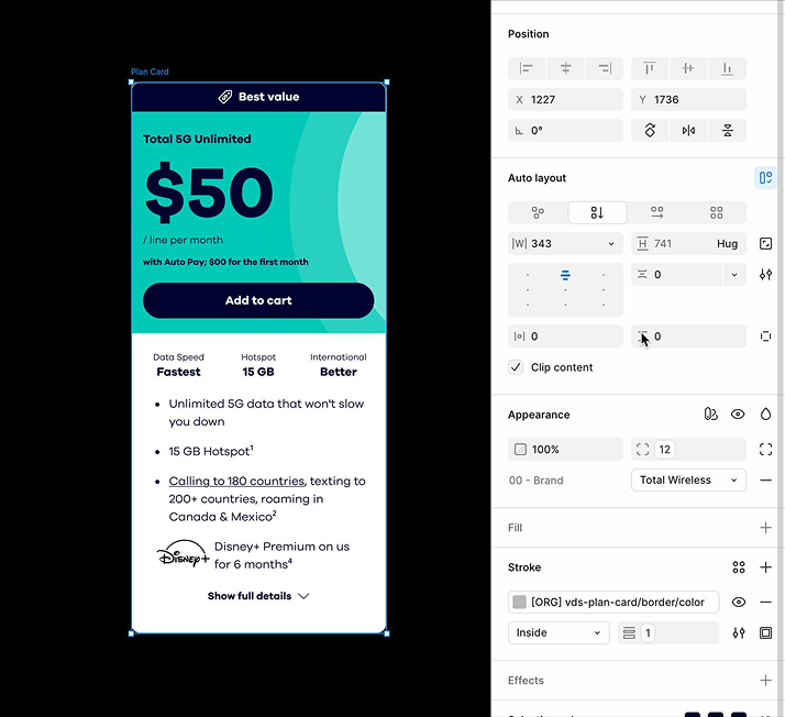
Build a scalable white-label design system. One Platform. Expressed Differently.
A scalable white-label design system built as a single source of truth where shared layout, interactions, and behavior could be themed through brand visual identity. Same UX, same engineering. No duplication. Just one component, expressed across brands.
From 16 complicated steps, to 8.
The activation and purchase flows were audited end-to-end. Unnecessary steps cut, redundant screens combined, key decisions surfaced earlier.
The system
Global Structure. Brand-specific nuance.
Standardized grid models to enable reuse and faster development. Delivered a global layout with brand-specific pricing, promos, and legal nuance.
Shared component library across brands using semantic tokens to swap visual identity
Single source of truth for UI patterns, reducing design and engineering overhead across the full MVNO portfolio
Clean hierarchy enabled faster decision-making through simplified layouts
The work
Optimized for scanning. Not just browsing.
539 bps
Device Gridwall Engagement
vs. BAU
Infused offers directly into the grid
Contextual promotions embedded within the browsing flow without interrupting the experience
Applied specific brand considerations
Total Wireless visual identity honored across every surface and interaction state
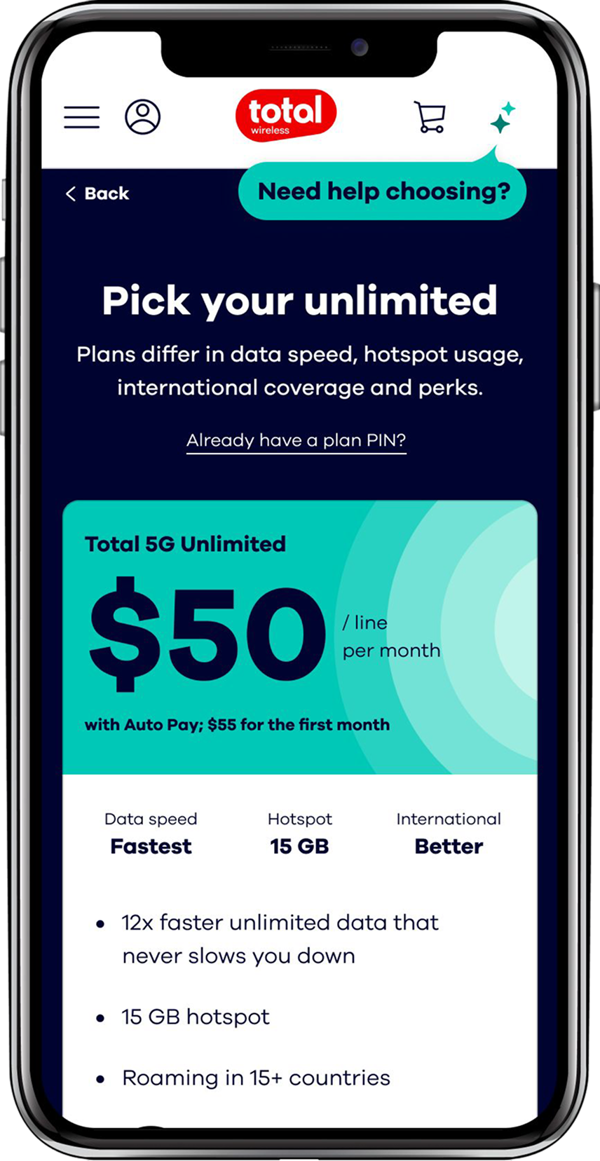
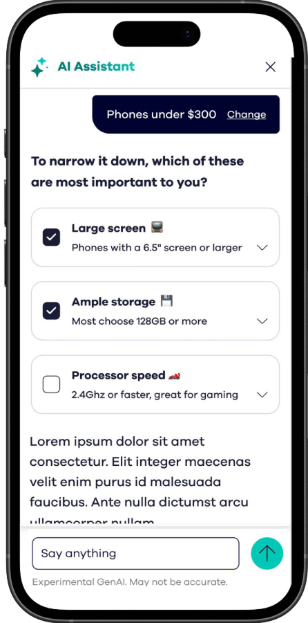
Just-in-time AI assistance
Smart nudges surfaced at critical decision points to guide users without friction
Standardized product cards
Unified patterns that simplified development effort across all Verizon-family brands
The impact
One decision flow. Device, plan, offer.
Unified browse, plan, and offer selection into a single decision architecture. Reduced friction and cognitive load by letting users scan and compare within a single streamlined flow.
14.3%
Add-to-cart improvement
vs. BAU
The AI layer
On-demand support. In context.
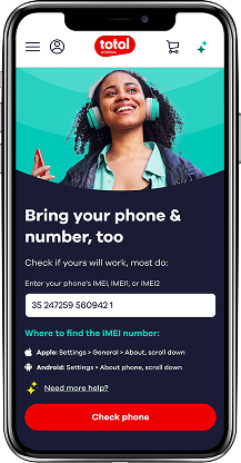
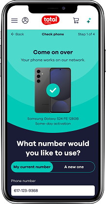
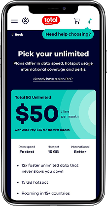
AI had long been reserved for flagship carriers. Total Wireless changed that, becoming the first prepaid brand to deliver AI-powered customer experience at the value tier.
The assistant was woven directly into the shopping flow, surfacing in context at high-friction moments without pulling customers off their path. A design decision as much as a business one.
What the assistant does
Guided filtering
Surfaces personalized filters and recommendations mid-browse, helping customers narrow by screen size, storage, and price without decision fatigue.
Contextual answers
On-demand AI chat embedded across browse and shop pages, responding to questions about plans, compatibility, and offers without leaving the page.
Native by design
Designed to feel native to Total Wireless, not bolted on from a third-party tool. Extended to Straight Talk with consistent behavior across both brand identities.
The result
Every surface moved the needle.
Add-to-cart, conversion, and total sessions all climbed. The white-label design system itself delivered +25–50% speed to market across all Verizon prepaid brands.
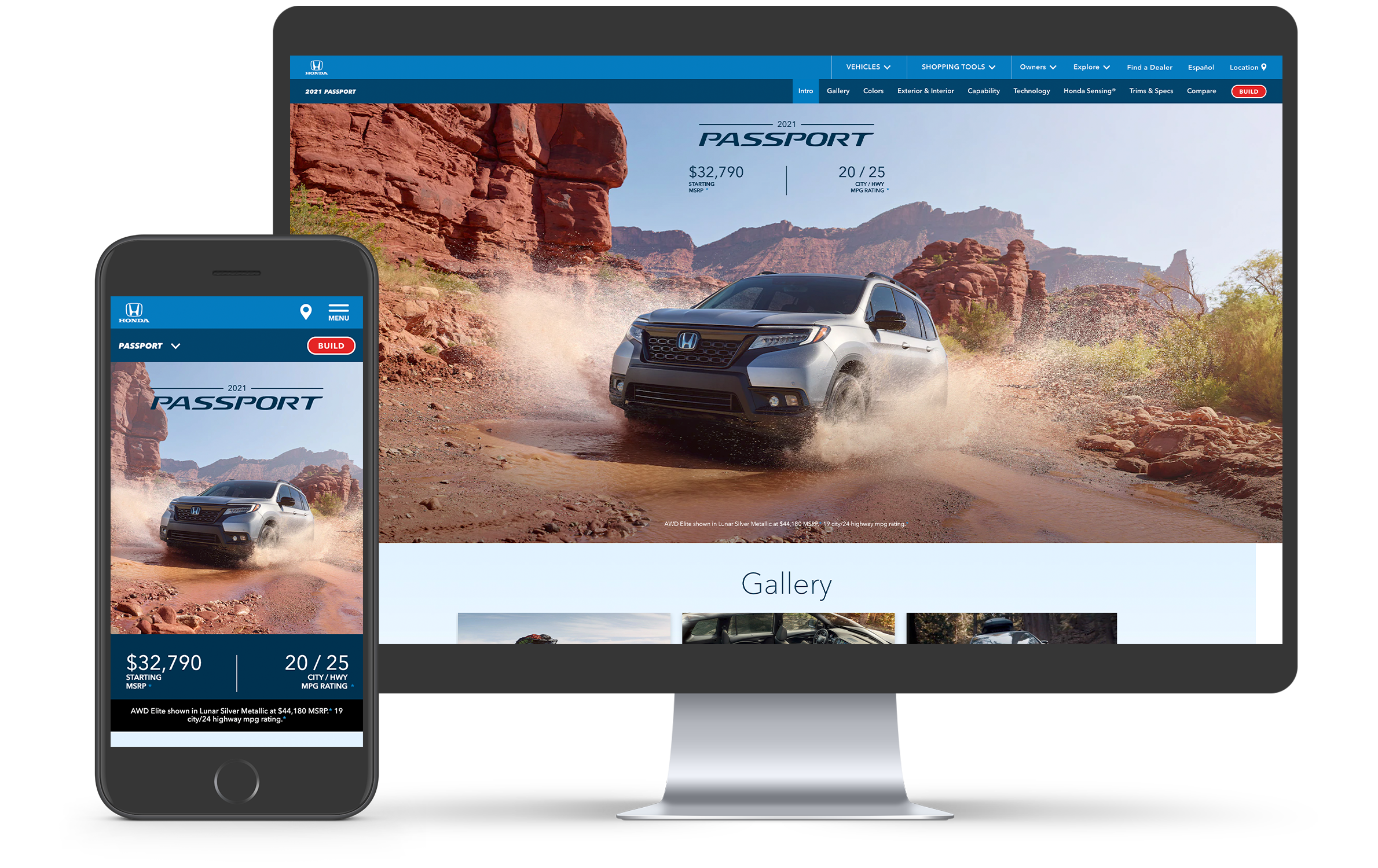
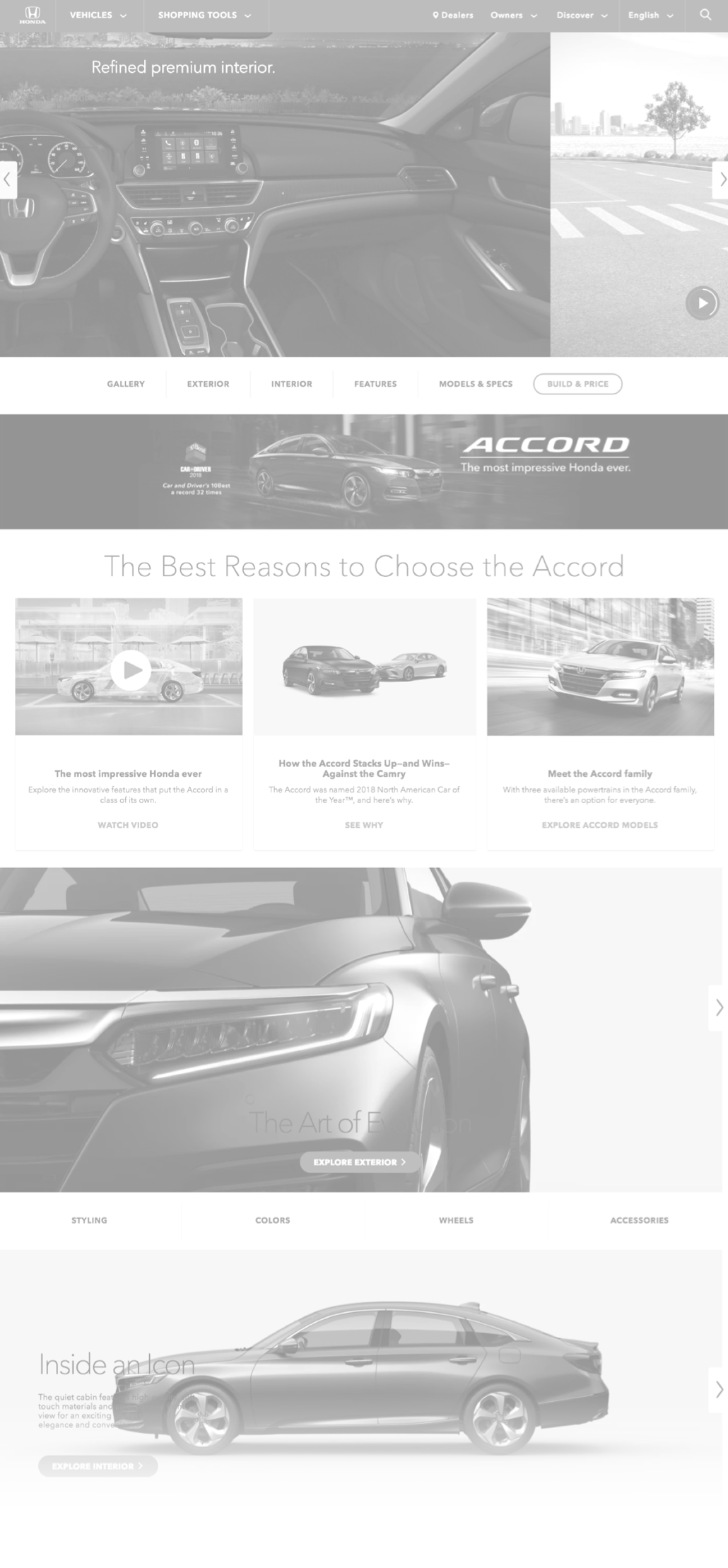
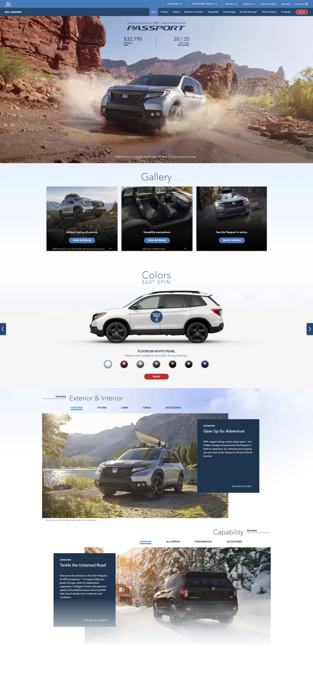
A recently redesigned site that still had problems to solve.
The Honda Autos site had just gone through a redesign. But its star attraction, the vehicle landing page, was loaded with heavy animations, slow load times, and a layout that buried the information users actually needed. The site was beautiful to look at, but painful to use.
Slow, animation-heavy pages
Unnecessary animations slowed page load and buried key vehicle information users actually needed
Usability gaps in rankings
JD Power MWES rankings highlighted critical usability gaps that needed addressing
Complex stakeholder landscape
70+ stakeholders across three organizations required constant alignment and communication
Outdated content hierarchy
Page layout buried key vehicle specs and pricing below the fold, misaligning with how shoppers actually browse
BeforeAfter
The solution
Four features. Four deliberate improvements.
Over the course of a year, our team tackled several major features on the website that were problematic, building confidence and momentum across the engagement.
Vehicle landing page
Improving speed, readability and layout of the page that serves as the star of the Honda Autos experience.
Paid media microsite
Redesigning a static paid marketing website into a customized, full-featured user experience.
Build & Price module
Updating the vehicle configuration tool based on JD Power MWES insights and user research.
Seasonal campaigns
Designing marketing landing pages that maintained brand consistency while driving seasonal engagement.
The system
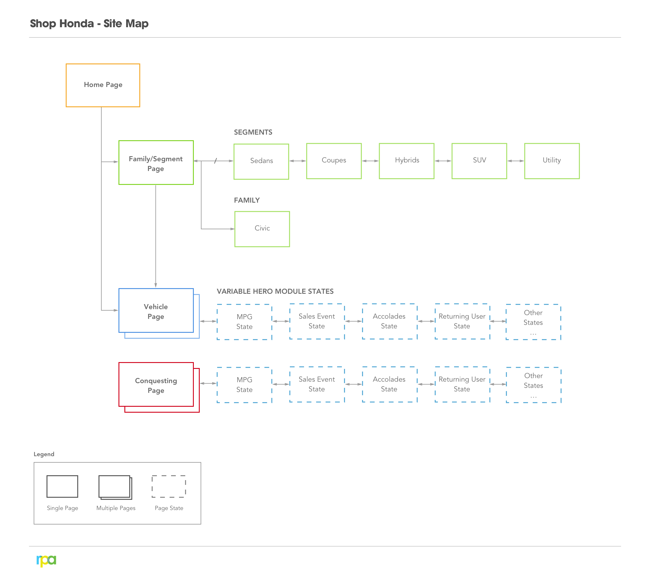
Mapped the entire experience.
Before touching any UI, we mapped the full site architecture, identifying user flows, entry points from paid media, and the critical paths that drove engagement. This foundation informed every design decision that followed.
The process
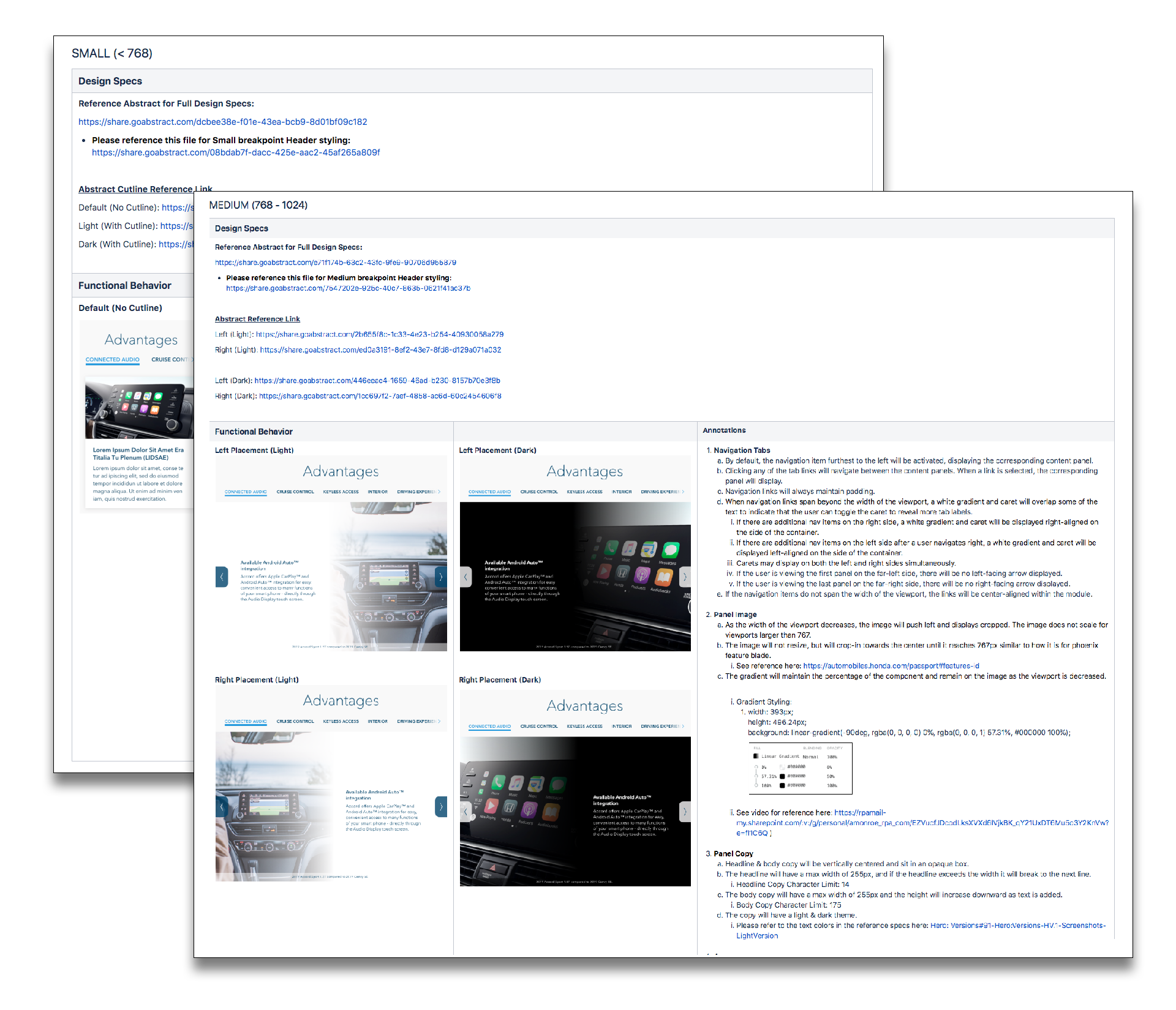
Documentation as a design tool.
Confluence became the central source of truth for all stakeholders, documenting feature requirements, breakpoint behavior, and interaction specifications. This ensured alignment across 70+ stakeholders spanning three organizations.
Feature requirements in Confluence
Breakpoint behavior and interaction specifications documented as the single source of truth for all stakeholders
Interactive prototypes
Mobile and desktop prototypes built in InVision Studio and Proto.io, reducing ambiguity and accelerating sign-off
All breakpoints covered
Design views delivered across every breakpoint to ensure pixel-perfect implementation across devices
Stakeholder alignment
Documentation bridged the gap across 70+ stakeholders spanning Honda, RPA, and the development agency
The work
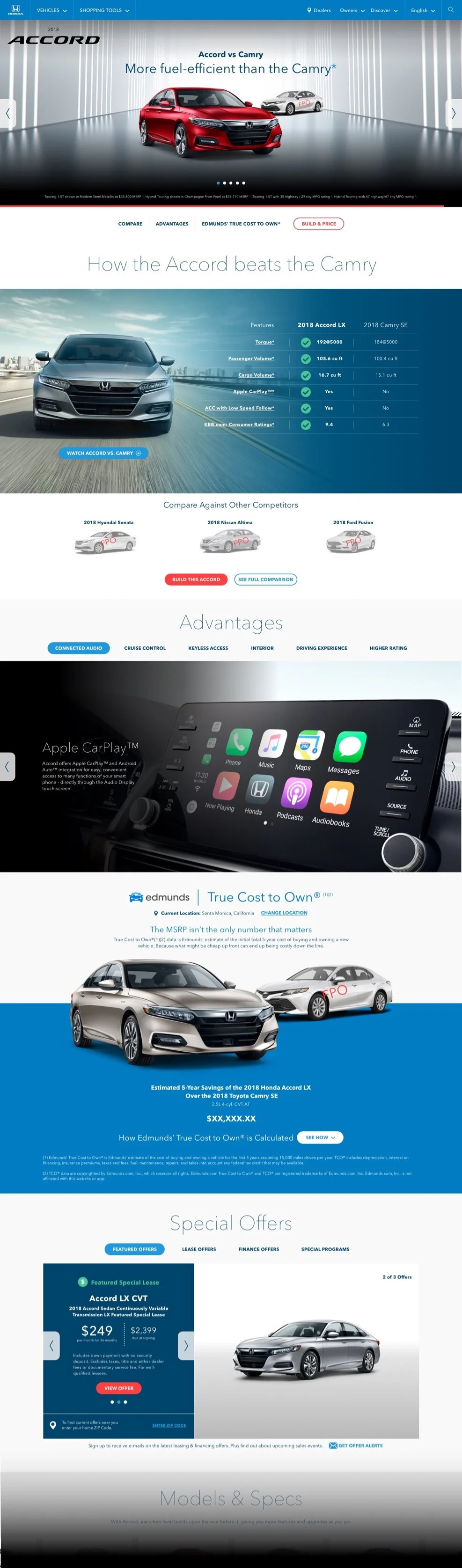
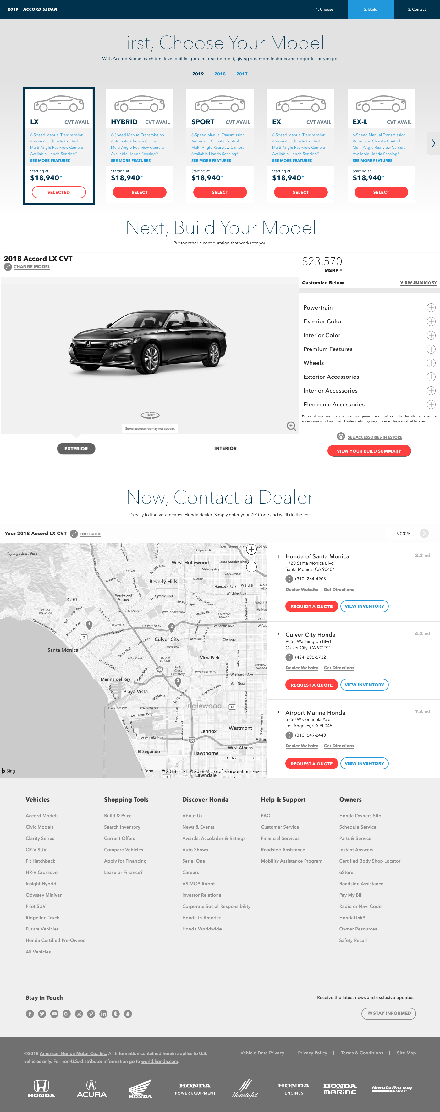
The vehicle landing page. Rebuilt for speed.
The vehicle landing page is the star of the Honda Autos site. We had 3 months to improve speed, readability, and layout, while keeping the brand team's vision intact. I learned Proto.io in under a week to build a fully functioning prototype for stakeholder presentations.
Eliminated heavy animations
Improved page load speed and readability by removing unnecessary motion that buried key vehicle information
Restructured hierarchy
Surfaced key vehicle details first, aligning the layout with how users actually scan and compare models
Interactive prototype
Learned Proto.io in under a week to deliver a fully interactive prototype for 70+ stakeholder presentations
Brand team collaboration
Balanced performance improvements with the brand team's creative vision through iterative review cycles
Interactive prototype demonstrating the redesigned feature blade component
The pivot
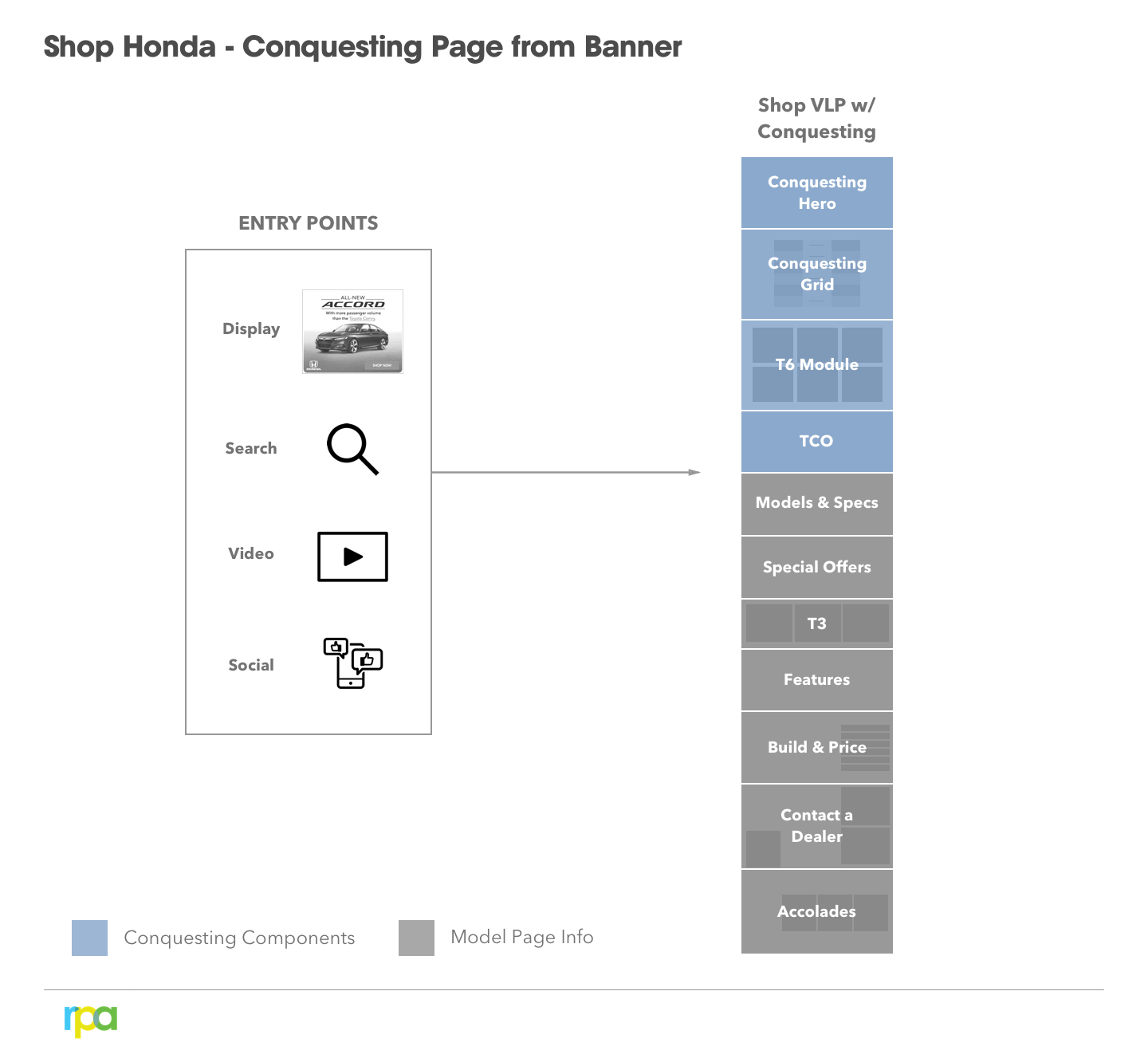
A microsite that became a flagship experience.
What started as a redesign for a paid media microsite turned into a customized user experience for the flagship autos website. We expanded the original scope to include conquesting user flows, paid media entry points, and a seamless handoff between marketing touchpoints and the core shopping experience.
Dynamic content system
Page content adapted automatically based on the paid ad entry point for personalized experiences
Conquesting flows
Designed user flows to convert competitor-brand shoppers into Honda prospects
Seamless handoffs
Created smooth transitions between marketing touchpoints and the core shopping experience
Expanded scope
Grew from a simple microsite redesign into a full-featured experience integrated with the flagship Honda Autos site
The module
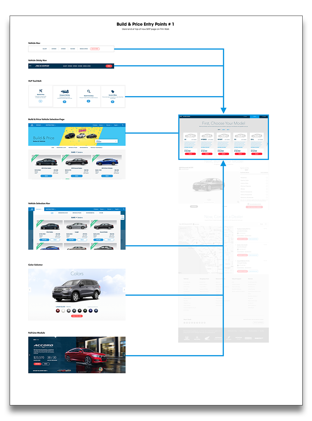
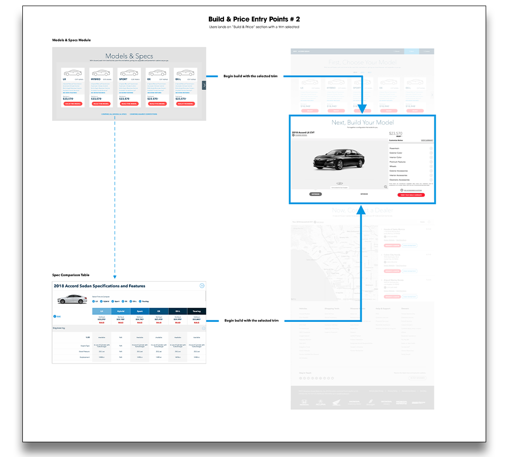
Build & Price. Standalone and streamlined.
Using JD Power's Manufacturer Website Evaluation Study as one of the most unsurpassed benchmarks, our team made data-backed improvements. The key insight: remove the entire Build & Price feature from the Vehicle Landing Page to a standalone page, reducing load time and giving users a focused configuration experience.
Standalone page
Moved the entire Build & Price module to its own page, significantly reducing vehicle page load time
Focused configuration
Gave users a dedicated, distraction-free experience for building their Honda
Data-driven architecture
Architectural decision was directly informed by JD Power MWES data and user research insights
Build & Price entry points from the vehicle landing page
Alternative entry flow with trim pre-selected
Full Build & Price standalone experience on desktop
JD Power MWES
Top of the rankings.Manufacturer Website Evaluation Study
After implementation, Honda climbed to the top of the JD Power MWES Rankings. Four features shipped in twelve months, each grounded in data, aligned across stakeholders, and validated by the industry's most respected benchmark.
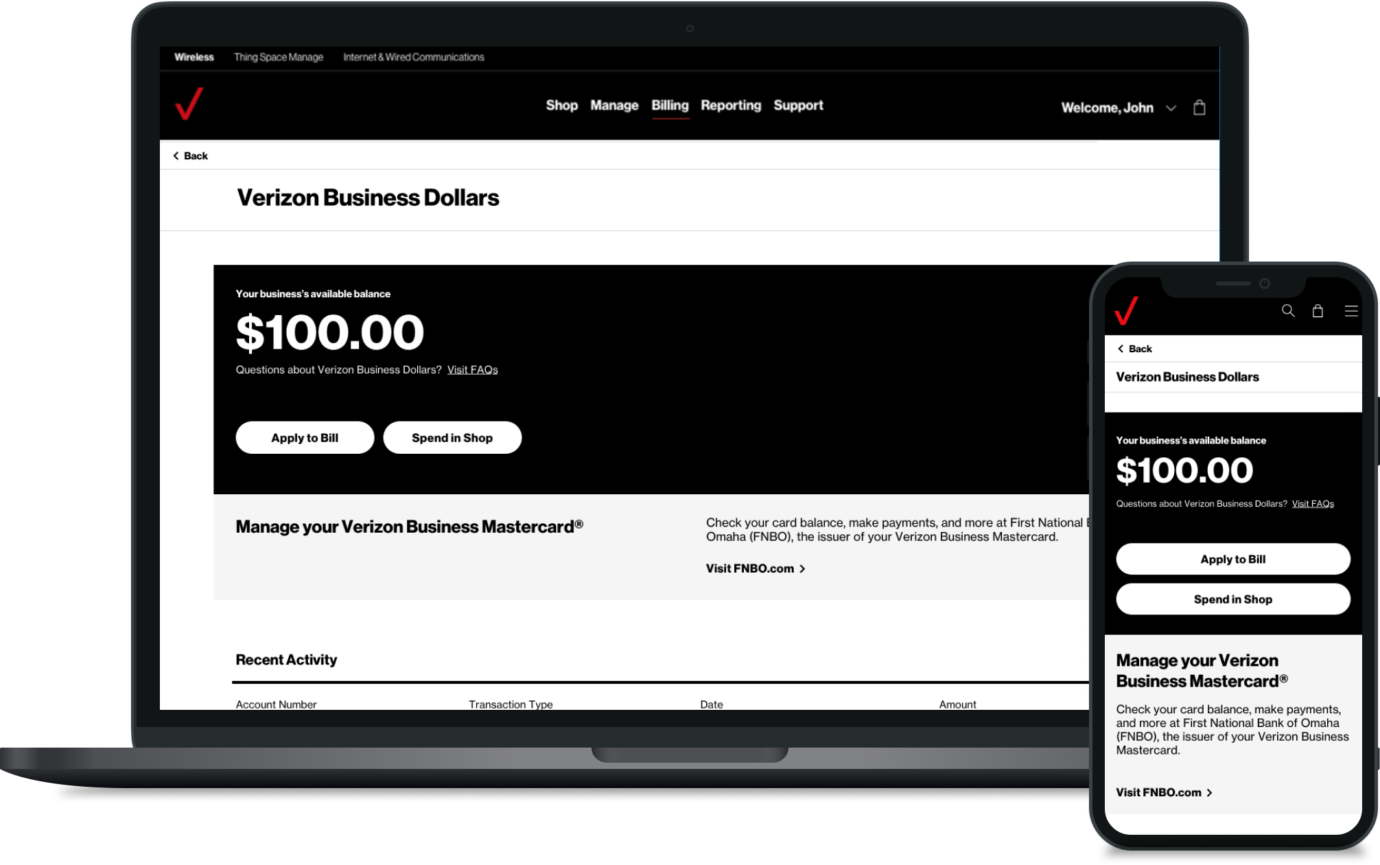
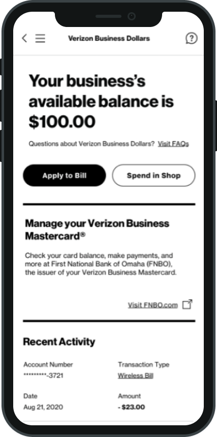
Build loyalty into the small business relationship.
The Verizon Business Mastercard was a new product category for Verizon's Small Business Group: a co-branded credit card that let SMB customers earn Verizon Business Dollars and redeem them against bills and equipment. The goal was to deepen loyalty in a segment where churn is costly and relationship-building is a long-term business driver.
The design challenge was making the redemption experience feel native to the MyBusiness portal, not a bolt-on from a partner bank. Multiple user types with different mental models all needed a unified experience.
Net-new and existing customers
Call-center representatives
MyBusiness Portal end users
The research
Heuristic audit. Holistic solution.
Before a single screen was designed, we conducted a heuristic analysis of the existing MyBusiness portal to identify where a loyalty and redemption layer could integrate without creating friction. This audit determined where Business Dollars would live in global navigation, where the redemption flow would intercept billing, and how the Mastercard banner could surface at the right moments without feeling intrusive.
This research-first approach paid off: placements felt native to the portal because they were grounded in how users already moved through it, not imposed from a financial product's logic.
Led end-to-end design across portal and app as design lead and client-facing point of contact
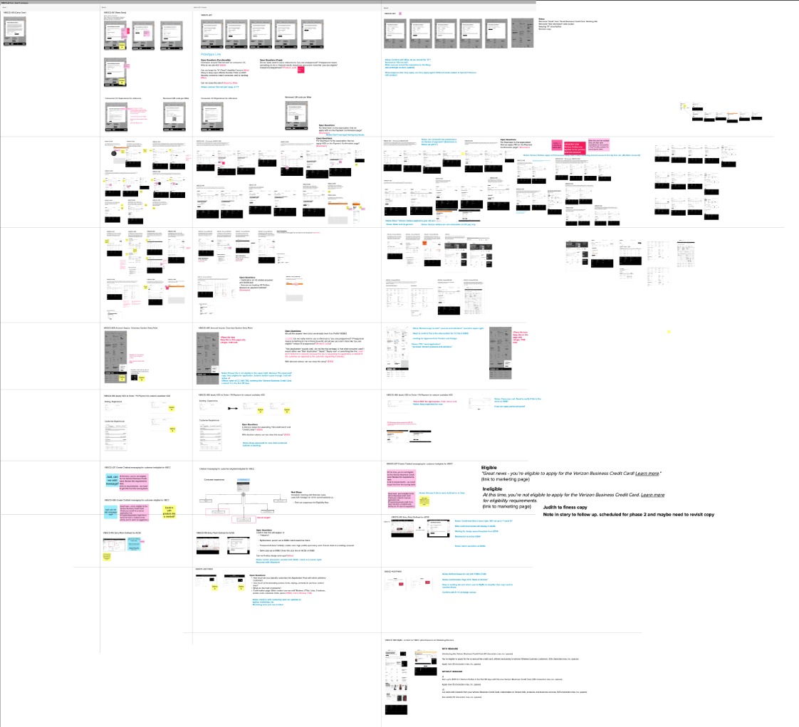
10 two-week sprints with dedicated Mural boards per sprint so stakeholders always had a current source of truth
InVision prototype of the full end-to-end experience served as primary developer handoff tool
Conducted VQA across all deliverables in production
The framework
Use cases.
The card experience was organized around three core user journeys, each designed to guide small business customers from awareness to action.
Learn
Educating users on the value of Verizon Business Dollars and the co-branded Mastercard offering.
Apply
Streamlined application flow integrated directly into the MyBusiness portal experience.
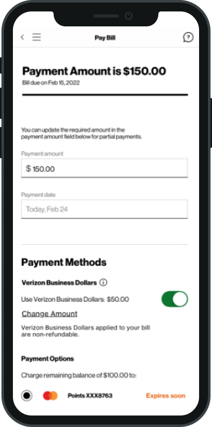
Redeem
Seamless redemption of Business Dollars toward bills, equipment, and account credits.
The execution
Leveraging VDS to build at scale.
The redemption experience had to be woven into the MyBusiness portal at the moments that mattered most, not siloed to a separate section users would never discover. Business Dollars in global navigation meant every session surfaced the balance. Redemption was embedded directly into the billing flow, where the dollar value was most tangible.
We worked within the Verizon Design System (VDS) to ensure every screen met enterprise standards while moving fast. The design system gave us consistency; the prototypes gave us confidence.
Added VBD to global navigation
VBD in Billing
InVision prototype
The expansion
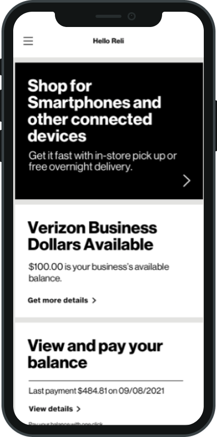
Sole designer. Six weeks. Native iOS.
The iOS app was not in the original project scope. It was added near the end of the timeline with a new set of stakeholders, a compressed six-week window, and no existing iOS design patterns for the Mastercard experience. As the sole designer on this workstream, I had to earn trust with a new stakeholder group while simultaneously auditing the app, designing the experience, and preparing for VQA.
The institutional knowledge built across 10 portal sprints became the accelerant. Patterns, decisions, and rationale that would have taken weeks to re-establish were already internalized, which is why six weeks was enough.
Audited the existing My Verizon for Business iOS app to map patterns and integration points
Designed the complete Mastercard redemption experience for native iOS, alone, in 3 two-week sprints
Completed Visual Quality Assurance in production, ensuring the live app matched designs pixel-for-pixel
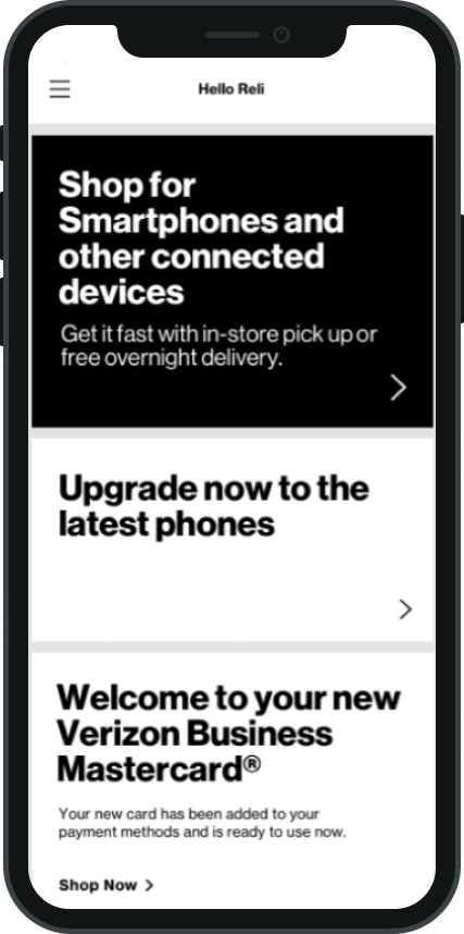
Launched
June 22, 2022A new card. A new loyalty experience.
The Verizon Business Mastercard shipped a seamless redemption experience across web and native iOS to small business customers nationwide. Since launch, Verizon has gained share in the competitive SMB credit card space and grown brand loyalty among existing customers. The exact goals the product was designed to achieve.